- My Forums
- Tiger Rant
- LSU Recruiting
- SEC Rant
- Saints Talk
- Pelicans Talk
- More Sports Board
- Winter Olympics
- Fantasy Sports
- Golf Board
- Soccer Board
- O-T Lounge
- Tech Board
- Home/Garden Board
- Outdoor Board
- Health/Fitness Board
- Movie/TV Board
- Book Board
- Music Board
- Political Talk
- Money Talk
- Fark Board
- Gaming Board
- Travel Board
- Food/Drink Board
- Ticket Exchange
- TD Help Board
Customize My Forums- View All Forums
- Show Left Links
- Topic Sort Options
- Trending Topics
- Recent Topics
- Active Topics
Started By
Message
2020 MLS new kits
Posted on 2/6/20 at 7:44 pm
Posted on 2/6/20 at 7:44 pm
MLS staggers home and away kits every year, Nashville new to MLS so they have both
Inter Miami havent released thier other kit yet
Atlanta

Chicago Fire and their shitty new crest. and for some reason the only kit without the adidas shoulder stripes

FC Cincinnati

Colorado Rapids

Columbus Crew

FC Dallas

DC United

Houston Dynamo

LAFC

LA Galaxy

Inter Miami

Minnesota United

Montreal Impact

Nashville


New England Revolution

NYCFC

NY Red Bulls

Orlando

Philadelphia Union

Portland Timbers

Real Salt Lake

San Jose Earthquakes

Seattle Sounders

Sporting KC

Toronto FC

Vancouver Whitecaps

Inter Miami havent released thier other kit yet
Atlanta
Chicago Fire and their shitty new crest. and for some reason the only kit without the adidas shoulder stripes
FC Cincinnati
Colorado Rapids
Columbus Crew
FC Dallas
DC United
Houston Dynamo
LAFC
LA Galaxy
Inter Miami
Minnesota United
Montreal Impact
Nashville
New England Revolution
NYCFC
NY Red Bulls
Orlando
Philadelphia Union
Portland Timbers
Real Salt Lake
San Jose Earthquakes
Seattle Sounders
Sporting KC
Toronto FC
Vancouver Whitecaps
 10
10


Posted on 2/6/20 at 8:05 pm to LSUMJ
Adidas is so bad

Posted on 2/6/20 at 8:28 pm to BRUNNIN4
They used to be so good too. These are like faux throwbacks. 3 stripes are classic, these not so much.
Posted on 2/6/20 at 8:36 pm to ezride25
They look too baggy, like we went back to the 2000's.

Posted on 2/6/20 at 8:46 pm to LSUMJ
Chicago is the only one I like
And I like their new crest
And I like their new crest

Posted on 2/6/20 at 9:48 pm to I Bleed Garnet
LA and NYRB look pretty cool. That three stripe nonsense is kind of garbage though.

Posted on 2/6/20 at 10:05 pm to cwil177
Shitty pic for Miami
Posted on 2/6/20 at 11:04 pm to LSUMJ
Lol Adidas template is awful. Wtf is that shawl collar??
Posted on 2/7/20 at 6:06 am to cwil177
quote:
NYRB look pretty cool
Yea i like the RB logo too
Also think what the company itself is doing badass

Posted on 2/7/20 at 7:45 am to LSUMJ
Like :
ATL
Chi (crest looks ok on this kit)
Crew
FCD
Hou
LAFC
Inter (depending on sponsor)
Minny
Montreal
*NASHVEGAS IS HAWT*
NYRB
ORL
Phi
POR
SJ
VAN
WTF:
Cincy
NE
RSL
KC
Adidas
ATL
Chi (crest looks ok on this kit)
Crew
FCD
Hou
LAFC
Inter (depending on sponsor)
Minny
Montreal
*NASHVEGAS IS HAWT*
NYRB
ORL
Phi
POR
SJ
VAN
WTF:
Cincy
NE
RSL
KC
Adidas
Posted on 2/7/20 at 8:39 am to LSUMJ
It’s hard for me to tell if I like any of them because they’ve done such a shitty job of displaying them.

Posted on 2/7/20 at 9:07 am to LSUMJ
Nashville marketing team must've been like, "when we reveal our new kits, we need to find models that will make people who don't like soccer hate it even more."
Posted on 2/7/20 at 9:35 am to Xenophon
A few of these are actually pretty great, but most are meh or fugly.
The biggest problem is the template itself. What was Adidas thinking with approving that design? The way the panels are stictched together looks weird and terrible. The collar looks strange, and the sleeves look silly. They went way too tryhard on a retro look, and it looks bizarre.
And I hate this new trend of two-tone kits when most teams have more than two standard colors. With some colors (like Toronto and Columbus) a two-tone look is fine, but don’t do it for New York City. That San Jose away jersey is hideous.
And I’m disappointed that Miami won’t have a pink kit in Year 1, when they’re the only team in the league to use pink as a color. There are way too many white jerseys already in this league. Be unique! Especially since we no longer have third kits.
Posted on 2/7/20 at 9:49 am to Michael Stein
It’s also worth noting that MLS kits are using a new font this year to celebrate the 25th season. Not sure if they’ll use this after the 2020 season or they’re taking a “wait and see the sales” approach.
Here’s a picture of the new font. It was designed by a firm in Manchester.
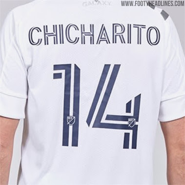
Here’s a picture of the new font. It was designed by a firm in Manchester.
This post was edited on 2/7/20 at 9:50 am
Posted on 2/7/20 at 10:47 am to Michael Stein
I like it.
Posted on 2/7/20 at 10:48 am to Michael Stein
quote:
And I’m disappointed that Miami won’t have a pink kit in Year 1
Where did you see this?
They actually haven't released their home kit yet, that's just the away.
Is there some kind of home kit that isnt?
This post was edited on 2/7/20 at 10:52 am
Posted on 2/7/20 at 1:31 pm to I Bleed Garnet
All the Inter Miami fans I’ve seen on Reddit are pretty convinced it’ll be a white kit this year, based on some leaks from their sources.
Hopefully that’s not the case. But usually by this point of the MLS offseason the kit leak news is pretty accurate. Back in 2016, that hideous Columbus Crew away kit leaked a few months early and it ended up being legit.
Hopefully Miami will get a pink kit in the near future. Would be very sharp.
Hopefully that’s not the case. But usually by this point of the MLS offseason the kit leak news is pretty accurate. Back in 2016, that hideous Columbus Crew away kit leaked a few months early and it ended up being legit.
Hopefully Miami will get a pink kit in the near future. Would be very sharp.
Posted on 2/7/20 at 6:12 pm to LSUMJ
Yay corporatism
Posted on 2/7/20 at 7:04 pm to LSUMJ
Its hard for me to like any of them but the fire. Cant get over every one of them having that 3 stripe sash.

Posted on 2/7/20 at 7:10 pm to LSUMJ
I forgot about Seattle’s Zulily sponsor. 

 Page 1 of 2

Popular
Back to top