- My Forums
- Tiger Rant
- LSU Recruiting
- SEC Rant
- Saints Talk
- Pelicans Talk
- More Sports Board
- Winter Olympics
- Fantasy Sports
- Golf Board
- Soccer Board
- O-T Lounge
- Tech Board
- Home/Garden Board
- Outdoor Board
- Health/Fitness Board
- Movie/TV Board
- Book Board
- Music Board
- Political Talk
- Money Talk
- Fark Board
- Gaming Board
- Travel Board
- Food/Drink Board
- Ticket Exchange
- TD Help Board
Customize My Forums- View All Forums
- Show Left Links
- Topic Sort Options
- Trending Topics
- Recent Topics
- Active Topics
Started By
Message
re: Brink back the old end zones
Posted on 10/9/18 at 11:44 am to jlovel7
Posted on 10/9/18 at 11:44 am to jlovel7
quote:
If the Geaux Font isn't considered iconic then LSU doesn't have an iconic font. ETA for clarification: None of LSUs old fonts would be considered iconic.
LSU paid an out of state firm big bucks to come up with the Geaux font and a new logo, which turned out to be the hated Toonces.
Why did we need an "iconic" font anyway? Florida did the same and their font is ugly as hell.
This post was edited on 10/9/18 at 11:47 am
 0
0

Posted on 10/9/18 at 11:45 am to jlovel7
quote:
the Geaux Font LSU has become iconic.
I bet you're a toonces man too.

Posted on 10/9/18 at 11:47 am to Dupont3
I much prefer the way they are now and I'm an old fricker.
Posted on 10/9/18 at 11:48 am to Mo Jeaux
frick no. Toonces is awful. But the Geaux Font LSU is clean and unique. I had no idea it was so hated by this board. Also this is without the shadowing that was initially attached to it.
Posted on 10/9/18 at 11:49 am to Dupont3
How about like Notre Dame's and Pittsburgh Steelers with the diagonal stripes but make them Tiger stripes. UMemphis does it.

Posted on 10/9/18 at 11:52 am to TNTigerman
quote:
How about like Notre Dame's and Pittsburgh Steelers with the diagonal stripes but make them Tiger stripes. UMemphis does it.


Posted on 10/9/18 at 11:52 am to jlovel7
Geaux font is iconic? Lol
Posted on 10/9/18 at 11:54 am to GeorgeTheGreek
I like The font in the helmets.
Don’t see it anywhere else
I hare The gray font on the basketball uniforms,
And I dont Like that we added a weird ring LSU to the football uniforms.
Don’t see it anywhere else
I hare The gray font on the basketball uniforms,
And I dont Like that we added a weird ring LSU to the football uniforms.
Posted on 10/9/18 at 12:09 pm to JAB528
quote:
Bring back the 2003 roster and coaching staff too.
holy shite this
Posted on 10/9/18 at 12:09 pm to Dupont3
support!
Posted on 10/9/18 at 12:26 pm to BruceUnhinged
quote:While the endzone did look pretty sweet, they're fine like they are now. I think the old block endzone letters is tapping into a little nostalgia for y'all and better times for LSU Football.
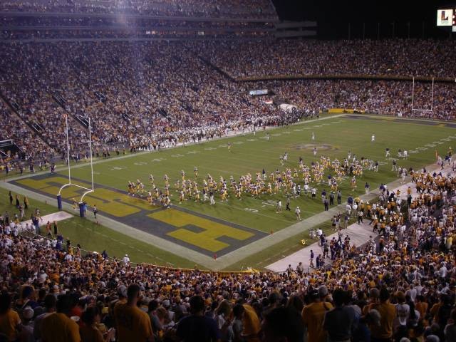
Another part of the aesthetic in this picture that I think y'all are underrating is how barren everything looks. You can only see TWO ads in that pic, the Louisiana Lottery on the old south scoreboard and I'm guessing peoples health over the visitors' tunnel. I mean seriously, no special logos on the 25 yard lines, no bigass Allstate field goal net, no electronic banners for Waitr, no Verizon this, Coca-Cola that, none of the 36 current McDonald's ads.
A lot has changed since this photo, but the endzones are not a hill to die on.
Posted on 10/9/18 at 12:30 pm to jlovel7
quote:
If the Geaux Font isn't considered iconic then LSU doesn't have an iconic font.
The geaux font isnt much different than all the other "unique" fonts other schools have. Miami, oregon, etc...
Posted on 10/9/18 at 12:33 pm to Dupont3
Anything was better then the field we had in the 90s under dinardo. That shite was so plain and disgusting. Old blocks were the goats.
Posted on 10/9/18 at 12:34 pm to jlovel7
am I alone in automatically thinking about Jefferson Pilot every time I see the endzones with the block font?
Posted on 10/9/18 at 12:40 pm to Dupont3
I support this. I have thought it quite a few times.
Also for whatever reason, the "gold" that we currently paint one endzone with ends up looking very neon-ish yellow like Oregon.
I suspect this is something to do with the paint and the grass, but still, wouldn't mind a change.
But of course as long as there is an LSU player with the ball in the endzone, I will be ok with how it is painted.

Posted on 10/9/18 at 12:48 pm to Dupont3
Posted on 10/9/18 at 2:42 pm to Dupont3
The end zone for the 2014 bowl game against Iowa was pretty nice looking too.
Posted on 10/9/18 at 2:55 pm to jlovel7
I never intimated or asserted that other fonts were iconic. I simply stated that while around 15 years old, geaux font is NOT iconic.
Posted on 10/9/18 at 3:01 pm to RedPop4
quote:
I never intimated or asserted that other fonts were iconic. I simply stated that while around 15 years old, geaux font is NOT iconic.
I would argue. To me iconic does not "necessarily" equate to extreme age. After about 15 years, everyone who really even slightly follows college sports knows that's our font or would recognize it as "the LSU font". To me, that is what makes it iconic.
Posted on 10/9/18 at 3:01 pm to Dupont3
get rid of the tiger eye and paint toonces at midfield

 Page 2 of 3

Popular
Back to top