- My Forums
- Tiger Rant
- LSU Recruiting
- SEC Rant
- Saints Talk
- Pelicans Talk
- More Sports Board
- Fantasy Sports
- Golf Board
- Soccer Board
- O-T Lounge
- Tech Board
- Home/Garden Board
- Outdoor Board
- Health/Fitness Board
- Movie/TV Board
- Book Board
- Music Board
- Political Talk
- Money Talk
- Fark Board
- Gaming Board
- Travel Board
- Food/Drink Board
- Ticket Exchange
- TD Help Board
Customize My Forums- View All Forums
- Show Left Links
- Topic Sort Options
- Trending Topics
- Recent Topics
- Active Topics
Started By
Message
re: Twins release new uniforms
Posted on 11/18/22 at 4:01 pm to BamaFinland

Posted on 11/18/22 at 4:01 pm to BamaFinland
Rob Wilfong
 0
0

Posted on 11/18/22 at 4:11 pm to Broski
2 and 4 aren’t bad. M hat sucks. 1 and 3 just seem like they were changed unnecessarily. The Twins don’t actually had a bit of uniqueness to it.
Gene Larkin
Gene Larkin

Posted on 11/18/22 at 4:19 pm to TexasTiger08
Chuck Knoblauch
They were always strong with the consonants!
They were always strong with the consonants!
Posted on 11/18/22 at 4:21 pm to PJinAtl
Posted on 11/18/22 at 4:26 pm to CRDNLSCHMCPSN11
Rod Carew
Posted on 11/18/22 at 4:35 pm to DrewTheEngineer
Frank Viola
Posted on 11/18/22 at 4:37 pm to Broski
decent
Posted on 11/18/22 at 5:02 pm to Broski
Embarrassed to say I just not realized that “twins” means “twin cities”. I guess that’s how little I ever think about the Minnesota Twins.
Posted on 11/18/22 at 6:28 pm to AtlantaLSUfan
Greg Gagne

Posted on 11/18/22 at 7:05 pm to Broski
I like them.
Randy Bush
Randy Bush

Posted on 11/18/22 at 7:09 pm to Broski
I like the uniforms, but like others have said, the “M” hat looks like the Marlins’ logo.
Posted on 11/18/22 at 7:15 pm to Broski
I mean, what's wrong with going back to these? They did win two World Series in them.

/cdn.vox-cdn.com/uploads/chorus_image/image/69748269/72379257.0.jpg)
Posted on 11/18/22 at 8:14 pm to Broski
Lofty uniforms, mate - approve of just about everything. Don't love love the new M hat logo yet but might be a grower. 
Posted on 11/18/22 at 8:17 pm to Spelt it rong
quote:Ebonics?
frick with the Twins one heavy
Posted on 11/18/22 at 9:11 pm to msudawg1200
quote:
I mean, what's wrong with going back to these? They did win two World Series in them.
The Billy Haywood era classics
Posted on 11/18/22 at 9:48 pm to CRDNLSCHMCPSN11
quote:
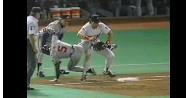
Didn't he push Gant off the bag in the World Series?
More like pass blocked him straight off the bag, and the dumbass ump still called Ronnie out and didn't call obstruction on Hrbek.
Cheating mother fricker. frick him.
Posted on 11/18/22 at 9:54 pm to SteelerBravesDawg
Baker’s Terry Felton.
Posted on 11/18/22 at 10:02 pm to Broski
I wouldn’t have noticed a difference.
Posted on 11/18/22 at 11:03 pm to SirWinston
Just another team moving to the “cleaner” look by removing outlines and whatnot. The TC and old M logo were great. Again…I think they were becoming classic logos. Now, they join a list of teams with an identity crisis.
Diamondbacks
Guardians (obviously)
Marlins
Padres
Rangers
Brewers
Astros are off the hook because these unis are associated with winning
Nike’s city connect have been hit or miss also. There’s a big surprise
Diamondbacks
Guardians (obviously)
Marlins
Padres
Rangers
Brewers
Astros are off the hook because these unis are associated with winning
Nike’s city connect have been hit or miss also. There’s a big surprise

 Page 3 of 4

Popular
Back to top