- My Forums
- Tiger Rant
- LSU Recruiting
- SEC Rant
- Saints Talk
- Pelicans Talk
- More Sports Board
- Coaching Changes
- Fantasy Sports
- Golf Board
- Soccer Board
- O-T Lounge
- Tech Board
- Home/Garden Board
- Outdoor Board
- Health/Fitness Board
- Movie/TV Board
- Book Board
- Music Board
- Political Talk
- Money Talk
- Fark Board
- Gaming Board
- Travel Board
- Food/Drink Board
- Ticket Exchange
- TD Help Board
Customize My Forums- View All Forums
- Show Left Links
- Topic Sort Options
- Trending Topics
- Recent Topics
- Active Topics
Started By
Message
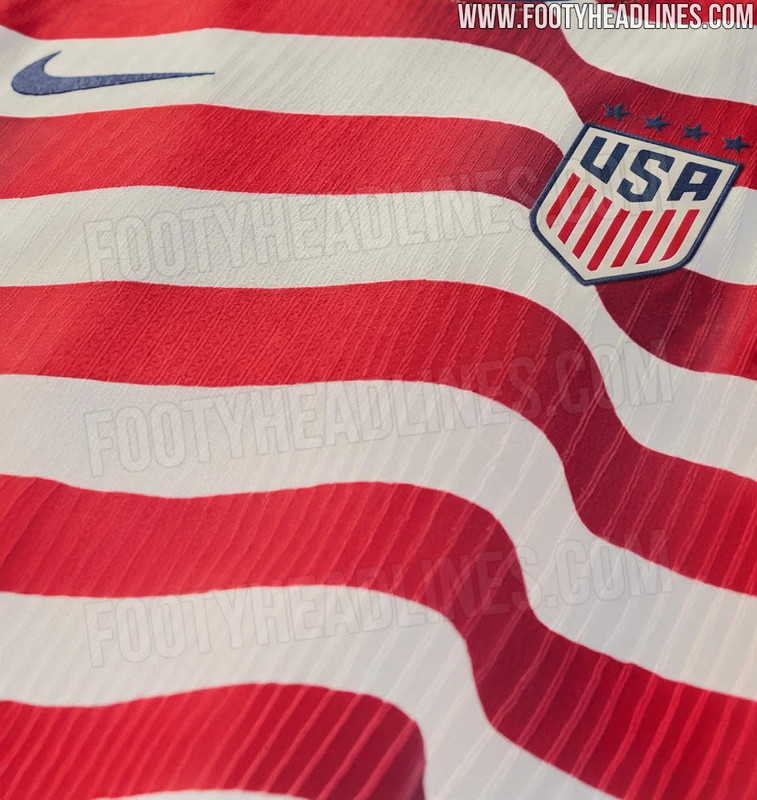
The US WC home kit may have just leaked, and it's beautiful
Posted on 1/6/26 at 9:21 am

Posted on 1/6/26 at 9:21 am
I know Footy Headlines has been wrong before, but if this is indeed the main kit, Nike got it right.
Link to article
Link to article
This post was edited on 1/6/26 at 9:24 am
 7
7

Posted on 1/6/26 at 10:00 am to BCLA

Just noticed the 4 stars. I hope this isn't a situation where the men have a different jersey than the women.
This post was edited on 1/6/26 at 10:01 am

Posted on 1/6/26 at 11:17 am to BCLA
I hope so. It's about damn time we get back to the GOAT USA jersey.

Posted on 1/6/26 at 12:01 pm to BCLA
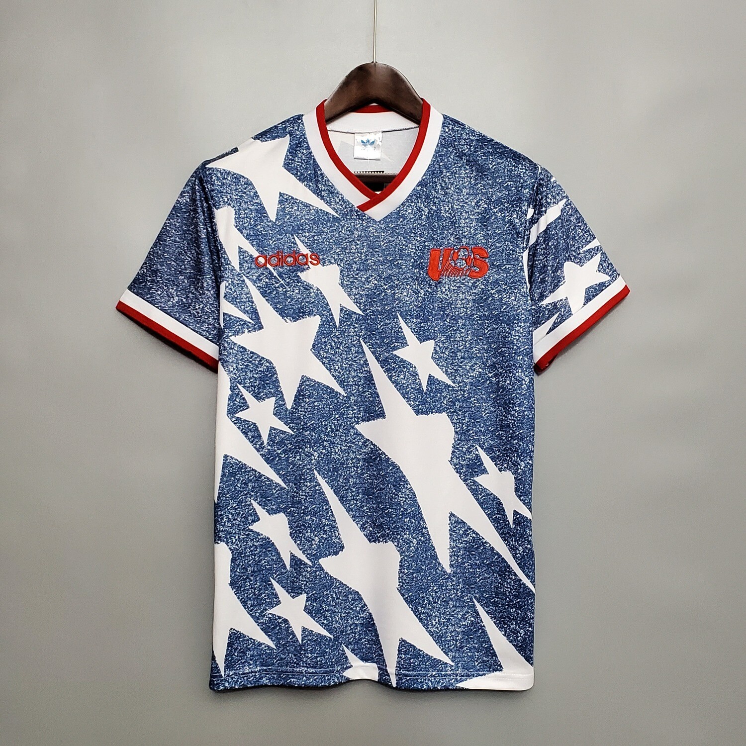
Should bring this masterclass back as the away kit
Posted on 1/6/26 at 1:20 pm to DestrehanTiger
quote:
Just noticed the 4 stars. I hope this isn't a situation where the men have a different jersey than the women.
Hopefully not. Usually the women wear the same in the world cup year, then get their own for the women's WC the following summer. I definitely remember the girls wearing those God awful ones we had in 22
Posted on 1/6/26 at 3:25 pm to BCLA
Absolutely beautiful
This post was edited on 1/6/26 at 4:33 pm

Posted on 1/6/26 at 4:24 pm to BCLA
ehh, nat a fan of the wavy lines.

Posted on 1/6/26 at 4:31 pm to Broski
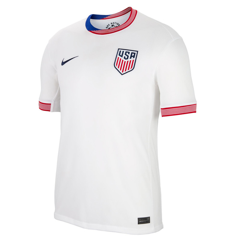
And the away kit leaked as well... it's awful. I hate it when we change up the coloring on the crest and the navy is closer to that graphite blue we used for 2010 World Cup Qualifying.
LINK
 >
>
With both kits, we're clearly trying to do a spiritual homage to the 94 kits, but man, I think we missed the mark.
For the home kit, all we had to was basically copy the Waldo's and it would've been perfect.
LINK
> With both kits, we're clearly trying to do a spiritual homage to the 94 kits, but man, I think we missed the mark.
For the home kit, all we had to was basically copy the Waldo's and it would've been perfect.
This post was edited on 1/6/26 at 4:33 pm
Posted on 1/6/26 at 7:28 pm to Broski
They’re both terrible. Nike can suck so bad sometimes.
Posted on 1/6/26 at 11:07 pm to MetArl15
The Waldo’s are fantastic. Not loving the away at first glance.
Posted on 1/7/26 at 9:50 am to Broski
Well, on second glance, I'm not a big fan. Why can't Nike just keep it simple? Why can't USSF tell them to just give us normal Waldos? I haven't liked hardly any of the designs of the USMNT kit in over a decade.
Posted on 1/7/26 at 11:30 am to MetArl15
quote:
They’re both terrible. Nike can suck so bad sometimes.
Agreed.
Posted on 1/7/26 at 11:37 am to SUB
quote:
Well, on second glance, I'm not a big fan. Why can't Nike just keep it simple? Why can't USSF tell them to just give us normal Waldos? I haven't liked hardly any of the designs of the USMNT kit in over a decade.
The best kits we've had since the crest redesign in 2016 have also been the most embarrassing because it was supposed to be our kits for the 2018 World Cup.
Every other kit for us in the last 10 years has either been a white t-shirt, too loud or just part of a template Nike lazily used for all its teams.
Posted on 1/7/26 at 11:48 am to Broski
quote:
The best kits we've had since the crest redesign in 2016 have also been the most embarrassing because it was supposed to be our kits for the 2018 World Cup.
Every other kit for us in the last 10 years has either been a white t-shirt, too loud or just part of a template Nike lazily used for all its teams.
Yep. Those are the only kits I've liked.
Posted on 1/7/26 at 12:35 pm to Broski
The stripes legit give me motion sickness  I love the blue one but I like really simple uniforms.
Posted on 1/7/26 at 12:43 pm to St Augustine
quote:
The stripes legit give me motion sickness I love the blue one but I like really simple uniforms.
I just can't get into the silver and graphite crest.
It reminds me of that one women's world cup where the US women were wearing kits that were white, black and neon green.
It's a World Cup you're hosting, the crest and kit should be your colors.
Posted on 1/7/26 at 4:26 pm to BCLA
If they advance far, they will become fan favorites. Bet.
Posted on 1/7/26 at 4:41 pm to Broski
I was a big fan of the Nations League kits in the 2020/2021 time frame. These should be our permanent homes, with the same design in blue for the aways.

Posted on 1/7/26 at 4:45 pm to Broski
Our kits this past year were better than the blue ‘18s. I did like the whites though.
I just want us to standardize the home and away kits to help with establishing a traditional identity while we are growing interest in the beautiful game here at home… Something recognizable abroad.
Home: Waldos
Away: Bomb Pops
Third: Use this to experiment with designs every year.
I just want us to standardize the home and away kits to help with establishing a traditional identity while we are growing interest in the beautiful game here at home… Something recognizable abroad.
Home: Waldos
Away: Bomb Pops
Third: Use this to experiment with designs every year.

 Page 1 of 2

Back to top