- My Forums
- Tiger Rant
- LSU Recruiting
- SEC Rant
- Saints Talk
- Pelicans Talk
- More Sports Board
- Winter Olympics
- Fantasy Sports
- Golf Board
- Soccer Board
- O-T Lounge
- Tech Board
- Home/Garden Board
- Outdoor Board
- Health/Fitness Board
- Movie/TV Board
- Book Board
- Music Board
- Political Talk
- Money Talk
- Fark Board
- Gaming Board
- Travel Board
- Food/Drink Board
- Ticket Exchange
- TD Help Board
Customize My Forums- View All Forums
- Show Left Links
- Topic Sort Options
- Trending Topics
- Recent Topics
- Active Topics
Started By
Message
re: Baseball Uniform Lineup
Posted on 1/29/26 at 9:55 am to rooloumama
Posted on 1/29/26 at 9:55 am to rooloumama
I think the backwards hat option will be legit this year.
 0
0


Posted on 1/29/26 at 9:55 am to Broski
quote:
Have we had gray pinstripes?
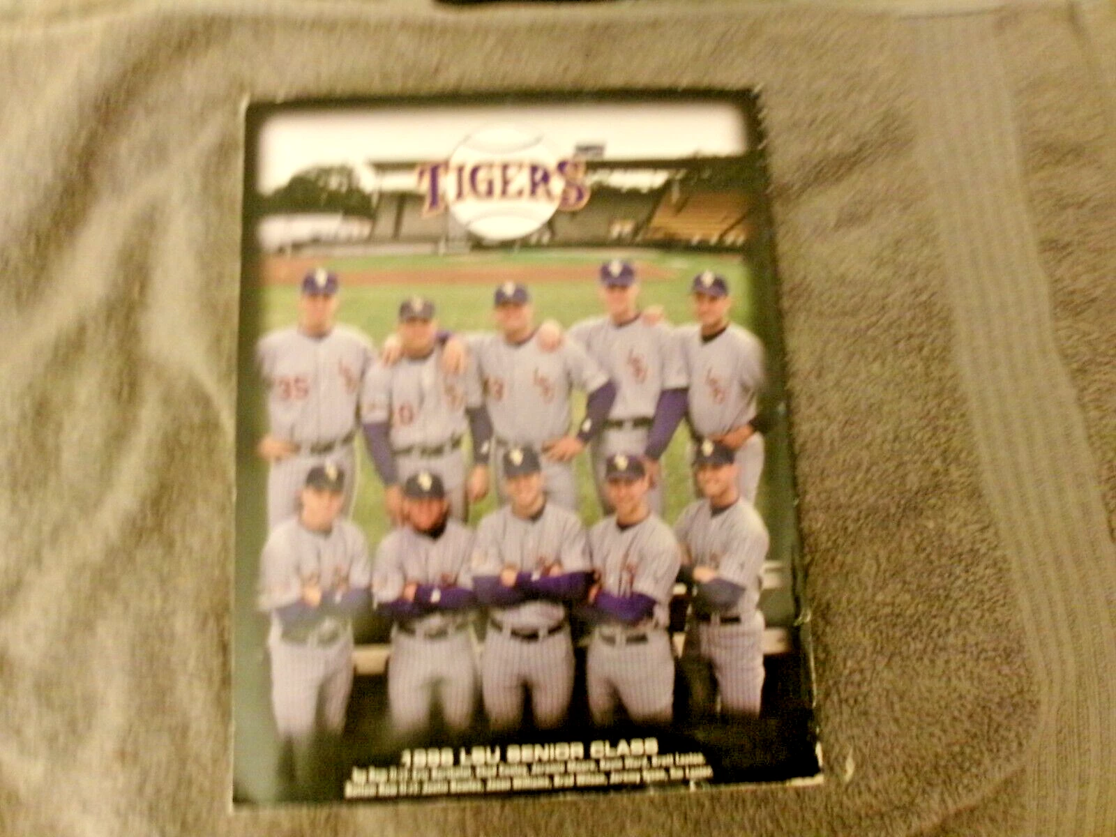
yes. Best picture I can find is a cover of the 1996 media guide on ebay
Posted on 1/29/26 at 9:57 am to Broski
quote:
white on gold and no accents.
no accents?


Posted on 1/29/26 at 9:57 am to lsufball19
quote:
no accents?
Wow you took that hyper literal.
Minimal accents.
This post was edited on 1/29/26 at 9:59 am
Posted on 1/29/26 at 9:59 am to Broski
quote:
Wow you took that hyper literal.
how so? Unless you have a non-literal definition of what an accent is.
Do you want to bring back shadow box numbers?
This post was edited on 1/29/26 at 10:00 am
Posted on 1/29/26 at 9:59 am to rooloumama
Does anyone else think that we should wear gray pants with the gold jerseys on the road?
I don’t think that combo would look as good as the white pants with the gold jerseys, but I just think the road team in baseball should always wear gray pants and the home team should always wear white pants.
I don’t think that combo would look as good as the white pants with the gold jerseys, but I just think the road team in baseball should always wear gray pants and the home team should always wear white pants.
Posted on 1/29/26 at 10:04 am to BayouPride
quote:
The all-gray with interlocking LSU is my favorite
Agreed. Especially nostalgic for that first CWS title team who dog piled in that uniform.

Posted on 1/29/26 at 10:04 am to rooloumama
If i had to power rank them right now:
1. Pinstripes- best uni by far
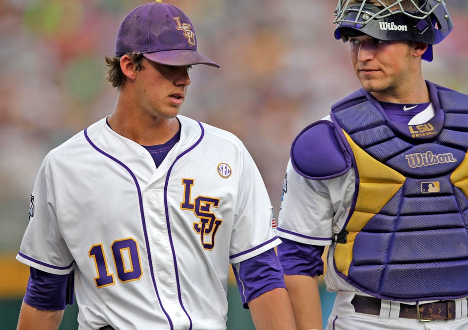
2. away grays. Super clean. The white outline in the logo makes it pop.
3. gold Jerseys - Need some contrast on the sleeve. I think the simple white and purple space stripes we had Circa 2009-2016 were really nice.
4. Purple
5. Like i said, the piping through the letters across the chest drive me nuts and they would be so good if they were just the white version of our away uniforms (easily 2nd best maybe give pinstripes a run for their money)
1. Pinstripes- best uni by far
2. away grays. Super clean. The white outline in the logo makes it pop.
3. gold Jerseys - Need some contrast on the sleeve. I think the simple white and purple space stripes we had Circa 2009-2016 were really nice.
4. Purple
5. Like i said, the piping through the letters across the chest drive me nuts and they would be so good if they were just the white version of our away uniforms (easily 2nd best maybe give pinstripes a run for their money)
Posted on 1/29/26 at 10:15 am to lsufball19
My point is that there needs to be more purple than white when it comes to what’s on the gold. Looks so much better from a contrast standpoint
Posted on 1/29/26 at 10:21 am to ProjectP2294
quote:
And he's such an incredible human being after how he handled going from A&M to Texas.
I don’t think we have any room to pass judgment for how a coach handled leaving for a conference rival
Posted on 1/29/26 at 10:22 am to Broski
quote:
I don’t think we have any room to pass judgment for how a coach handled leaving for a conference rival
I'm not going to make an argument that Lane Kiffin is a stand up guy though.
Posted on 1/29/26 at 10:24 am to rooloumama
Outside of the Sunday golds I think I'm partial to the gray tbh. I just love those uniforms

Posted on 1/29/26 at 10:24 am to rooloumama
I will always be a pinstripe guy. I'm happy we wear them more often now.
Posted on 1/29/26 at 10:56 am to Broski
I’ll say this, I a usually not a fant of white letter on light color jerseys.
At this point i could imagine them any other way, and yes they have the Purple outline.
I honestly hate outlines on lettering in general BUT I think all of ours work.
“also I will say it drives me crazy that the purple uniform has a space between the white letters and the gold outline when the white and gold jerseys don’t.
I also think our piping on the gold is a slightly different purple than the letters.
Posted on 1/29/26 at 11:00 am to Broski
quote:
LSU began wearing black uniforms as far back as 1999. Bruce Sprowl didn't come to LSU until 2003
They started recruiting him in 8th grade (1997).
Posted on 1/29/26 at 11:03 am to rooloumama
Would like to see the words Fighting Tigers in script across a white uniform,
Posted on 1/29/26 at 11:09 am to rooloumama
Male models making NIL at Woman’s clinic.
Just hanging out like some hunks of meat for the wolves.
Just hanging out like some hunks of meat for the wolves.
Posted on 1/29/26 at 11:17 am to rooloumama
quote:The white outline is the worst part. It makes the logo appear smaller and harder to make out from a distance.
2. away grays. Super clean. The white outline in the logo makes it pop.
They gotta figure out the white and grays. Piping is still too thick and the purple on the logo is still too thin and has a white outline now for some reason. Revert to this VVV
This post was edited on 1/29/26 at 11:24 am
Posted on 1/29/26 at 11:33 am to LSU CRAZY
quote:
I’m a fan of the grays.
You and me both, pal
White hot take, but I don't love the "golds"
Posted on 1/29/26 at 11:34 am to skullhawk
We should never wear black at all in any sport at LSU.

 Page 3 of 4

Popular
Back to top